
Khaki color sits between sandy tan, muted beige, and earthy olive, depending on the fabric, brand, and context. Traditional versions lean yellow-brown, while modern fashion labels sometimes use the name for greener tones. For U.S. shoppers, that range explains why two garments with the same color label can look noticeably different.
| Quick fact | What to know |
|---|---|
| Traditional appearance | Dusty yellow-brown or sandy tan |
| Modern fashion range | Beige, tan, brown-green, and muted olive |
| CSS named-color code | #F0E68C |
| Common clothing use | Chinos, trousers, jackets, trench coats, skirts, and utility pieces |
| Easy coordinating colors | White, navy, black, cream, denim blue, burgundy, and brown |
| Undertones to check | Yellow, brown, green, or gray |
The shade is an earthy neutral rather than one rigid color. It usually falls between tan and muted yellow-brown, although clothing brands may use greener or olive versions. If you are choosing clothes, focus on the garment’s undertone and depth rather than relying solely on the color name printed on the label.
Key Takeaways
- The traditional shade is closer to dusty tan or yellow-brown than bright green.
- Fashion brands may use the name to refer to muted olive and brown-green tones.
- Digital color codes vary because historical, fashion, and web definitions are not identical.
- White, navy, cream, black, denim, burgundy, and brown are dependable outfit partners.
- Warm versions work well with earthy colors, while cooler versions suit navy, charcoal, and crisp white.
What Is Khaki Color?
The name khaki comes from a word meaning “dust-colored” or “dusty.” Merriam-Webster traces it through Hindi and Urdu to Persian, where the root means “dust.” Its military history also explains the muted, earth-toned character associated with the shade.
In American English, dictionaries commonly describe the color as light yellow-brown. Cambridge also recognizes yellowish-brown and greenish-brown variations. That difference matters because fashion has broadened the meaning over time.
The word can describe color, cloth, military-style clothing, or casual trousers. In the United States, the term “plaid” for clothing is often associated with light-tan casual pants, even though the fabric itself is not tied to a single precise shade.
Why It Can Look Tan, Beige, or Olive
There is no single physical swatch that every clothing company must follow. A garment labeled khaki may look pale and sandy in one collection but darker and greener in another.
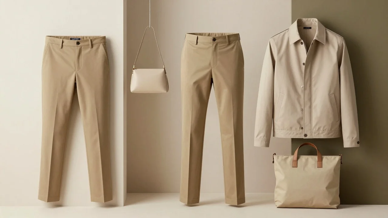
Think of the shade as a family of subdued earth tones. The most common versions fall into three groups:
- Sandy tan: Light, warm, and close to beige with more yellow or brown.
- Classic dusty brown: Muted and earthy, with enough depth to look distinct from cream.
- Olive-leaning neutral: Greener and darker, often used for jackets, cargo pants, and utility-inspired clothing.
This explains one of the most common shopping problems. A person orders a “khaki” jacket expecting tan and receives something closer to olive. When shopping online, trust the product photos, color description, and return policy more than the shade name alone.
Which Khaki Hex Code Should You Use?
Digital designers may encounter several codes for this color family. That does not mean one source is necessarily wrong. MDN lists the official CSS named-color value as #F0E68C. Figma’s color resource presents a more muted example, #D5C58A. The difference shows why web standards and fashion-oriented palettes should not be treated as one universal reference.
| Use case | Example code | Appearance |
|---|---|---|
| CSS named color | #F0E68C | Light yellow-tan |
| Muted design reference | #D5C58A | Dustier and softer |
| Dark CSS variation | #BDB76B | Deeper yellow-olive |
For website design, use an exact hex value rather than a color name when consistency matters. For clothing, compare real fabric or product photography, as lighting and textile texture affect how the shade appears.
Khaki vs Beige, Tan, and Olive
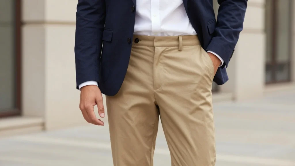
These colors sit close together, but they are not interchangeable.
Beige is usually lighter and softer. It often has cream, gray, or pale brown undertones.
Tan is more clearly brown and usually looks warmer. It can range from light camel tones to medium brown.
Olive contains more visible green. Darker utility jackets and military-inspired clothing often move toward this part of the spectrum. The shade covered in this guide sits between those families. Traditional versions favor tan and yellow-brown, while contemporary fashion can move toward olive. A simple comparison helps: beige feels pale, tan feels brown, olive feels green, and this earthy neutral can borrow qualities from all three.
What Colors Go With Khaki?
Because the shade is muted, you can pair it with both neutrals and stronger accent colors.
White and Cream
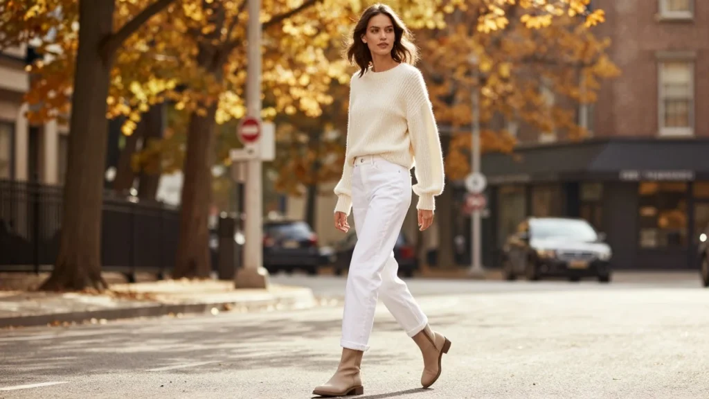
White gives the earthy tone crisp contrast. A white T-shirt with neutral trousers creates a clean casual outfit, while a white button-down makes the same base feel more polished.
Cream creates a softer result. It works especially well when the garment has warm yellow or brown undertones.
Navy and Denim Blue
Navy is one of the easiest darker partners. It gives light trousers more definition without producing the sharp contrast of black. Denim also works naturally because blue sits far enough from warm tan to create a sense of separation. Straight jeans with a sandy jacket are an easy weekend formula.
For another example of pairing earthy tones with footwear, see Styleliza’s green sneaker styling guide.
Black and Charcoal
Black makes the color feel sharper and more modern. Try dark tops, loafers, belts, or bags for a stronger contrast. Charcoal creates a softer transition. It suits business-casual outfits, cool-weather layers, and minimalist wardrobes.
Burgundy, Rust, and Brown
Rich reds work well with warm neutral clothing because they add depth without becoming fluorescent or overly bright. Burgundy is especially useful during fall. Chocolate and medium brown create a tonal outfit. Use different fabric textures so the pieces remain visually distinct.
Olive and Muted Green
Green can work well when the base garment leans tan rather than green. The combination feels natural because both colors share an earthy character. If the main piece already looks strongly olive, use cream, white, navy, or denim to create clearer separation. You can browse more seasonal color combinations through Styleliza’s Fashion section.
Why the Khaki Color Is Trending Again in 2026
Recent U.S. fashion coverage has moved the shade beyond its old school-uniform and office-pants image. InStyle highlighted it as a broader 2026 trend, while Who What Wear called attention to its return as a fashionable summer neutral.
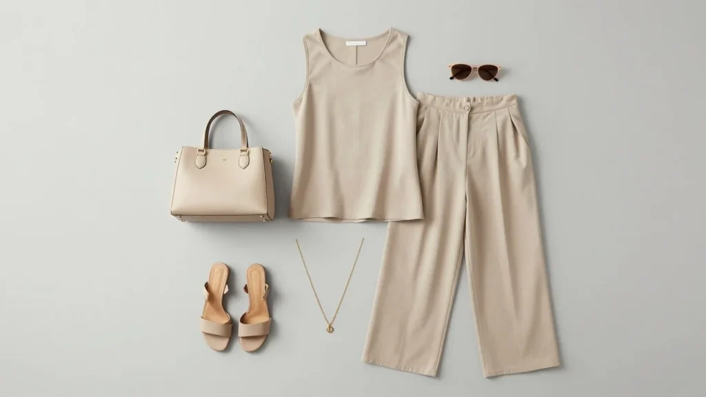
Current styling uses the tone in skirts, dresses, relaxed trousers, shorts, lightweight jackets, and matching sets. The newer approach also relies on looser silhouettes and cleaner styling. You do not need a full tonal outfit to use the trend. One neutral piece can ground a stronger color, print, or shoe.
Styleliza’s 4th of July outfit guide follows a similar principle, using cream, denim, white, navy, and bolder accent colors.
A Simple 3-Question Shade Test
When a color label feels unclear, ignore the name for a moment and ask three questions.
1. Does it look more yellow, brown, green, or gray?
That tells you the undertone.
2. Is it light, medium, or dark?
A pale sandy garment behaves differently from a deep military-inspired tone.
3. What happens beside pure white?
White makes undertones easier to see. Yellow-brown versions look warmer, while olive versions reveal more green.
This quick test is useful when choosing shirts, shoes, jackets, or accessories to match an item you already own.
How to Style the Shade for Different Occasions
- For a casual weekend, try neutral trousers with a white T-shirt, denim jacket, and clean sneakers.
- For business casual, combine tailored pants with a pale blue or white shirt. Add a navy blazer and brown loafers or flats.
- For summer, use a lighter sandy version with white, cream, soft blue, or muted green. Linen and cotton help the palette feel lighter.
- For fall, shift toward burgundy, chocolate, rust, navy, or forest green. Deeper colors give the neutral more seasonal weight.
- For a minimal outfit, choose two neutrals and one accent. For example, wear earthy trousers, a black top, and a burgundy bag.
The easiest rule is to create enough contrast between neighboring pieces. Two similar beige-brown shades can work, but their textures or lightness should distinguish them.
The Bottom Line
This earthy neutral is easier to understand once you stop treating it as one fixed swatch. Traditional versions are dusty yellow-brown, while fashion labels can move toward beige, tan, gray-brown, or olive.
Start by identifying the undertone. Then pair warmer versions with cream, brown, burgundy, or rust, and cooler versions with navy, charcoal, white, or denim. If you are building an outfit around a new neutral piece, check Styleliza’s latest fashion guides for more practical color and styling ideas.
Frequently Asked Questions
Traditional definitions lean toward yellow-brown or dusty tan. Modern fashion also uses the name for greenish-brown and muted olive shades. Check the undertone of the specific garment rather than assuming every version looks identical.
No. Beige is generally lighter and softer, while this shade tends to look earthier and slightly deeper. The two can overlap, especially in clothing catalogs where color names are not standardized.
For CSS, the official named color value is #F0E68C, according to MDN. A fashion or branding project may instead use a darker, dustier variation. Choose one exact code and apply it consistently.
The terms overlap, but they describe different things. “Chino” usually refers to a style or type of cotton-twill trouser. American shoppers may use a color-based term more broadly to refer to similar casual pants.
White sneakers, brown loafers, black shoes, tan sandals, navy footwear, and muted green sneakers can all work. Match the shoe to the formality of your outfit and create enough contrast with the pants.